Don't judge a book by its cover — — judge it by its spine
Written on 2 January 2013
“Always design a thing by considering it in its next larger context – a chair in a room, a room in a house, a house in an environment, an environment in a city plan.”
— Eliel Saarinen
Since old times, books have been the conduits of knowledge and learning. They are a symbol of civilised society, and until they perish from the world in favour of their digital counterparts they will continue to embellish shelves in millions of living rooms.
Many people organise the books on their shelves alphabetically by author or title; others group them by genre, or topic; and some combine the two methods. You can call these the information architects, thinking one step ahead and organising their library for findability. Makes a tonne of sense, does it not?
Well, yes of course, however thinking about it sideways…
Most of the books that most people own spend most of their lives snuggling cosily in an upright position on a bookshelf with their spine showing off. While not being searched for, they become part of the furniture and function as visual elements in your room’s interior decoration.
It therefore also makes a tonne of sense to think about what they look like, sideways, and perhaps organise them in a way which considers their contextual primary function. One such way could be arranging your library by the book’s physical height to create a specific silhouette (try waves or stairs), while another way could be colour-coding your library to achieve a smooth colour transition.
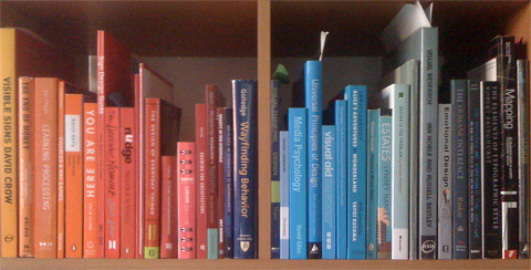
When browsing online bookstores we typically get an image of the book’s front cover next to its description. To emulate the bookstore experience Amazon and competitor online book retailers introduced the ability to ‘look inside’ and peruse some of the book’s content prior to purchase. I have no doubt that I’m in a minority in thinking of this as 2 ticks and one missed trick. Before buying a book, I would like to also be able to examine its spine.
What do you think? [3]
Wayfinding at Design Museum Holon
Written on 2 July 2011
Yesterday, I arranged to meet a friend at the main entrance to the BFI. We were both there at 12pm, but only managed to meet at 12:25 after she cleverly thought to ask whether the BFI has more than one entrance. I’m sure this sort of confusion happens often in places where the official entrance is off a side-street and what seems to be the obvious entrance isn’t in fact the primary one.
We got talking about mental models, spatial legibility and wayfinding, when I was presented with a question that seemed impossible to answer responsibly without taking up the whole afternoon: “What is the best wayfinding design you had come across?”, the answer to which heavily depends on the metrics used when evaluating the success of the design and I was unable to recall a single example that satisfies all key criteria.
Some of the most functional wayfinding systems I know, those that effectively help people navigate through an environment, aren’t particularly aesthetically appealing; some highly imaginative and beautifully crafted designs provide a pleasing experience, which in turn is undermined by the frustration rendered by their impracticality. Another typical evaluation criteria would be the level to which the design is sensitive to the physical context in terms of placement, choice of materials, colours, form, typography etc… and the extent to which this supports or inhibits the desired visitor experience.
On top of that, what was meant by ‘wayfinding design’ – was it the graphic, information and product design of a single sign; the design of a system of signs and how the content included in each supports the procedural process of wayfinding; or perhaps the design and manipulation of the physical environment to support effective wayfinding, based on considerations such as spatial complexity and sight-lines to destinations from different locations throughout the site?
I struggled to come up with an example for the best wayfinding design, however a particularly inspiring example that sprung to mind was Adi Stern’s wayfinding design for the Design Museum in Holon. It is clever, imaginative, original, highly functional and literally integrated into the interior space.

Design Museum Holon was designed by Ron Arad and bears some resemblance to Frank Lloyd Wright’s design of the Guggenheim in New York. Undoubtedly, the building’s key defining feature is its exterior which is made up of organically curled ‘ribbons’ of Corten. As demonstrated in the post-construction video below, the architecture itself supports wayfinding by delineating the path towards the main museum entrance.
The dynamic external structure is referenced by the curved three-dimensional arrows used internally for wayfinding communication. These arrows extrude in to the space, as if peeling out of the wall, their fascia retained in white as black edges and shadow create a Gestalt effect ensuring we identify the white arrows.

Overall, the site is relatively simple to navigate with only a handful of decision-points and sub-destinations, eliminating the need to clutter the space with too much directional information. Throughout the site, explicit wayfinding information is displayed only where it is absolutely necessary. No extraneous information is provided – a minimal design is used to communicate to visitors only the bare essentials.

On all three tiers, the single sign, the sign system and the spatial design, this is one of the most inspiring examples of wayfinding design I have seen in recent years.
What do you think?
The Type Shop
Written on 3 April 2011
Type is a new shop for type geeks and design enthusiasts that celebrates type in all non-digital forms. I came across it by pure chance – it is simply not what you’d expect to find while walking along Bethnal Green Rd. in East London.

Entering the shop, I was greeted by impressive typewriters of different styles and eras. A large heavy dark wooden table took up much of the space at the front of the shop, for people who want to sit and enjoy a hot beverage while consuming their type.
The table was designed by one of the three shop-owners who crafts one-off furniture pieces. Seated by it was Milan, one of the other shop-owners. He had just placed an old ruled sheet of paper into a typewriter and was in the process of typing the price-list for beverages sold at the shop. One by one, ink impressions were absorbed by the old paper, creating beautifully imperfect lettershapes.
Proceeding into the next room I discovered what in my eyes was the real treasure trove – a bookshelf displaying original foundry type specimen packs) with sheets of type in different point sizes. Also on display were Monotype newsletters dating as far back as the ’60s, each with a unique typographic cover design. They have all been preserved in mint condition. On another bookshelf was a selection of old books about typesetting and type design.

After half an hour of absorption in type, I left the shop with two new type acquisitions – an original Baskerville Type Specimen and Designer’s Kit and Monotype Newsletter #89 from July 1971 with a three-tone typographic front cover and a back-cover advertising the availability of Helvetica and Helvetica Bold for Monotype and Monophoto machines.
Into type? Go there.
Type
138 Bethnal Green Road, London E2 6DG
What do you think?
Issey Miyake pulls Dyson apart
Written on 2 January 2011
A crew of adorable, eery, quirky, fun and highly imaginative robot fashion models are currently manning the lower gallery at Design Museum Holon. Both garments and robot models are made entirely out of deconstructed Dyson vacuum machine parts.

Designed by Dai Fujiwara, Creative Director for Issey Miyake, the collection titled The Wind, was originally launched in the Spring of 2008 at 21_21 Design Sight in Tokyo.
It is fascinating to view them as holistic creatures and to examine specific body parts and garment sections in an attempt to identify their pre-adapted roles.
The Wind is part of an exhibition exploring the interplay between machines and haute couture: Mechanical Couture, Fashioning a New Order
Design Museum Holon
Running until January 08, 2011
What do you think?
From Wayfinding to Thingfinding
Written on 17 September 2010
Traditional wayfinding systems in the built environment typically provide effective support as we navigate our way to key destinations within a city.
This short treatise is about what they do not support.
The building blocks in any wayfinding system are the destinations the system directs us to; this is the raw data, without which there would be no need for the wayfinding system. A talk I gave at the
Information Design Conference last year, demonstrated how different methods of acquiring this data lead to quite diverse outcomes and subsequently to the development of wayfinding systems with varying levels of success for different people.
For example, when compiling a list of destinations, we may ask the client to provide the data, we may reference destinations listed on existing on-street signage, refer to destinations that appear on a map or site plan, or we can employ a user-centred design approach, conduct contextual research and find out from people in the street what destinations they are actually seeking.
Client representatives often have their own perspectives and agendas and they may not be able to understand, or be sympathetic to, visitors’ needs. A town centre-manager, in a city-centre wayfinding project I once worked on, felt it was his duty to look out for the financial welfare of local shop-owners. He wanted the retail district to appear as the key destination on all signs and the wayfinding system to direct all visitors to their destination via the retail district, even if that meant extending journeys by a considerable time and distance. Likewise, a tourism manager wanted all the main tourist attractions to make up the key directional information on signs.
What’s wrong with that, you might ask? Isn’t that what’s done everywhere? Well, perhaps, but commonly accepted ‘best practice’ isn’t always the best solution. The main tourist destinations are often well known and visitors can always ask locals for directions. When considering the limited amount of information signs can effectively communicate, it might be more helpful if signs included important destinations that not all locals would be able to point visitors towards. Furthermore, not all users of a city wayfinding system are tourists; visiting business people, new residents and many others require differing information which relates to their specific needs.

When asking people in the study-site what it is they’re after, the responses were extremely diverse and tended not to include the major landmarks. A user-centred approach has the greatest potential to reveal the actual needs of users and provide a list of destinations that is genuinely relevant for the people who visit and use the site.
Bearing in mind the title of this treatise, the point I wish to make is not just that effective contextual research can lead to better wayfinding solutions, but rather that effective contextual research reveals the limitations of wayfinding solutions.
When synthesising the results of contextual research through the magnifying glass of wayfinding planning, we extract the locational significance of what people are saying they’re looking for and discard the rest. We are then required to develop a taxonomy based on the most common denominator. “I am looking for a decent cup of coffee” will be distilled down and abstracted to something like “Food court” or “shops”. In the process we have lost two layers of specificity; the specific thing and the specific quality.
Wayfinding systems are limited in their ability to satisfy our need to find something specific that exists within a place. However, people are not looking for a destination simply for the purpose of arriving there. On most occasions, we are interested in something that exists within that destination: a specific shop, a specific business, a specific service, a product with specific features or quality. In order to find things, we need a system that facilitates thingfinding, a problem-solving process that is only partially fulfilled by wayfinding.

Thingfinding sounds impractical in the context of a wayfinding system, which clearly cannot provide directions to all important destinations, let alone to specific things. However, thingfinding is already a reality, using a growing number of location based services available on smartphones. These range from a basic map application that can display local things around us at greater granularity than any on-street wayfinding system could, through to location based social networks like Foursquare and Brightkite, through which people share qualities of their in-place-experiences. These provide rich metadata about places and things which exist within places. I’ve explained some of these thingfinding services and how they’re replacing wayfinding systems over at ID/Lab’s blog.
Physical and online experiences are no longer discrete experiences – the two are intertwined and the continuum between them is becoming more concrete. We no longer ‘go online’ – we are constantly connected. When connected, we no longer sit statically behind a desktop computer – we move through physical space, creating new associations between our online and offline presence. And we have greater tools and options by which to negotiate our way through physical space.
Online and real-world experiences are blending; so should their design.
Organisations are becoming open to the idea of integrated experience strategies that consider people’s experience across digital and physical space concurrently. One of the barriers to developing and implementing such strategies is the division of responsibilities within an organisation, where for example, the department that commissions digital solutions is segregated from the one which commissions physical solutions. Despite that, it’s becoming apparent that integrated experience solutions are the way of the future.
What do you think? [3]
Place for words
Written on 19 December 2009
Truth be said, this online space has had no content update for some 18 months now. And while my written musings have been shared in other places, this space has not been left untouched during this time.
In fact, over this period the site has experienced incremental design refinements. Every few months I’d spend a couple of days revisiting the design, adding elements and removing others; the brown paper has experienced age over time, and like me, has a couple more creases and blemishes then it did when the website was first published online; but the most substantial upgrade has been its recent elevation into a more imaginative headspace.
This webspace has become a living canvas with a story that unfolds over time in visual rather than verbal form.
While interesting to think of a website’s design as the narrative, rather than website as an environment for narratives, it is acknowledged that this space engages people mostly with its written content and that it is high time to add new notes on design and creative stuff.
How very timely it was to hear from my inspiring friend at Barcelona based Herraiz Soto & Co about Ommwriter, their new feature-poor, experience-rich text editor.
Yes, as someone who writes mostly in TextEdit or Mail to stir away from distracting, unpredictable word editor user interfaces that ‘know better’ than you what word you supposedly wanted to write, I find minimal, feature-poor text editors very appealing.
Supplementing the minimalist nature of this utility are a set of zen like visuals, ambient soundscapes and smooth interactions, contributing to a sense of intimacy with the writing environment, making this text editor a pure joy to use.
See for yourself..
The Ommwriter designers recognised the significance of the environment that envelopes words and how it contributes to a writing-state-of-mind.
Ommwriter beta version 2 was released yesterday. It’s free. Get it. Use it. Enjoy it. Follow it.
What do you think? [3]
DoubleYou Hi
Written on 8 May 2008
About a decade or so ago, design studios performed a peculiar ritual, which involved placing a webcam in their studios to project their office life out onto a publicly available website. It seemed the right thing to do at a time when internet technologies were in their infancy and carrying out such an ‘advanced feat’ denoted high technological skill and capability.
That naivety seems to have passed on from this world (in most cases). But just recently I came across the revival of the practice at Madrid’s DoubleYou agency.

Their website provides a two way interface between the studio and the spectator and the spectator and the studio.
While you satisfy your voyeuristic needs observing at the studio from within your own browser, you can also type a message which is displayed on an LED sign located inside the studio.
Similar examples are popping up all around us – some less literal and some more. In retrospect, this example may seem like a pointless experiment, just like the webcams a decade ago, but for now they mark the beginning of what is to come as designers and architects are increasingly embracing the concept of situated technologies.
What do you think? [1]
Mission: Menu
Written on 23 February 2008
A number of months ago, while walking through the back streets of Chippendale in Sydney, a real-estate agent sign drew me into a derelict, yet intriguing, little house which I soon discovered used to be a church. This converted 19th century church has since found a tenant and today houses on its ground level a charming little wine bar/restaurant, named Mission after the building’s original use, and a gallery on the upper level.
I am in two minds about Mission’s interior design: it incorporates too rich a palette of materials, finishes and lighting, which can initially dazzle those who have an eye for simplicity. However, all the details have been carefully orchestrated to create a cosy and pampering atmosphere, whether you are there to dine or drink. Behind the considered design, there is also a fine element of cheekiness, aimed at those who wish to see it.
A sense of play is also expressed by the restaurant menu, which explores a non-conventional approach to list the culinary selection. The traditional breakdown of meals, based on Entrée Main Dessert has been excluded from the menu and instead food is categorised by price range. The chunking of dish selection based on price range clearly implies the size of serving within each category, but it makes you think differently about what you order.

Whether you feel like 6 – 11, 12 – 17, or 18 – 26,
go there:
3 Little Queen Street
Chippendale, Sydney
What do you think? [1]
I Feel Fine, Thank You
Written on 8 September 2007
“Since August 2005, We Feel Fine has been harvesting human feelings from a large number of weblogs. Every few minutes, the system searches the world’s newly posted blog entries for occurrences of the phrases “I feel” and “I am feeling”. When it finds such a phrase, it records the full sentence, up to the period, and identifies the “feeling” expressed in that sentence (e.g. sad, happy, depressed, etc.)…”
[ Source: wefeelfine.org/mission.html ]

Reading the opening passage of the project mission statement, one can’t help but think that one or both of the project authors have been the subject of an alien abduction earlier in their life.
We Feel Fine is one of Jonathan Harris’s masterpieces brought to being with the help of Sepandar Kamvar.
The website represents the above-mentioned harvested data in a range of nifty visualisation modes. Viewers can easily switch between modes and observe the feelings represented as particles, colour shapes and text snippets to name a few. It was intriguing to observe that the most common feeling expressed by people is when they feel BETTER, followed by BAD and that GOOD came in third. But bearing in mind that people are less expressive when they feel fine, these results are less surprising.
We Feel Fine is not just a passive observation experience – users can play with the represented data. Each feeling can be clicked to bring up the originating blog or internet page and an intuitive user interface makes it easy to extract specific statistics by segmenting the results based on age, gender, date, geographical location and other characteristics. If by chance you feel like seeing how your feelings compare with your peer, We Feel Fine can help you find out. You may find that people in your hometown are happier than the world average, or that like you, many more people prefer living in that other city.
Visual wonders on the net are a great way to tune out and get distracted.
Whether you’ve just spent too many hours on Halo 3, or you are actually interested in statistics about how people feel, We Feel Fine ranks high on my list of things to do in times of procrastination.
Spare a moment to view Jonathan Harris’s presentation at TED 2007 or check out some of his other projects
What do you think? [1]
Banalities of the Perfect Home
Written on 21 May 2007
SLOT is an exhibition space that measures 2.35M high x 4.5M wide x 1M deep. It may sound a bit tight, but considering it’s slotted into a window, one should not compare it with a typical gallery. SLOT is located in the street level window of 38 Botany Road, Alexandria in Sydney. Like similar art spaces that face the street, SLOT blurs the boundary between the gallery and the street – artworks become public artworks. Art then becomes accessible for pedestrians, and more importantly, brought closer to people who wouldn’t otherwise be exposed to it.
In a very down-to-earth kind of way, SLOT’s website further elaborates on its location, mentioning that it is nestled between a laundrette and a Thai restaurant. Quite a nice Thai place I might add. I went there tonight to grab some takeaway and noticed the complete facade of the adjoining building had been covered by large white text highly contrasted by black background. This was an unexpected but pleasant surprise. For a fleeting moment I thought that what I’m seeing is a construction site concealed by a decorated hoarding. But that didn’t really make much sense. Quite quickly, I came to the realisation that this had something to do with SLOT.

For a space that measures only 2.35M high x 4.5M wide x 1M deep, this installation by Ruark Lewis is quite an undertaking. “The process of articulating and translating words in our environment–building meaning and rendering association–is something we do everyday subconsciously”. In Banalities of the Perfect Home Lewis encourages us to be aware of and question our immediate surroundings.
Unexpected ‘surprises’, such as this one, that appear in public urban spaces carry an important social value. They engage people in an untypical way, add vitality to our streets and enhance people’s everyday experiences.
Banalities of the Perfect Home on display until 2 June 2007
What do you think? [2]
The Feltron Report
Written on 19 April 2007

There is something extremely quirky about creating an annual report that summarises your own personal life over the past year. Nicholas Felton has been doing it for two consecutive years, demonstrating that clever information design can really make tables and charts visually interesting.
Earlier this year I came across Nicholas Felton’s Annual Report, in which he charts aspects of his life, such as visited places, read books and types of beers drank. He has kindly agreed to answer a few of my questions.
Q&A with Nicholas Felton
1. How long have you been practising as a designer? What areas do you focus on, or do you have special expertise in any area?
I have been professionally practicing for almost 8 years now. I’m comfortable in a range of work from publication to web to identity design… but my expertise would certainly lie in typography and logo work.
2. What is the design project that most inspired you in recent times?
The thing that inspired me the most recently was the alan fletcher exhibit at the design museum in london. His work is amazing, and the way that he reinvented himself and remained relevant through numerous chapters of his career is an even more universal lesson for all of us.
3. How and when did you first come up with the idea for the Feltron Annual Report?
The first proto-report was a project called Best of ’04, a typical wrap-up of the year which included a lot of my favorite discoveries from 2004, but also contained a few statistical gems that I was able to unearth from my notebooks, itunes and computer.
The next year, the Annual Report was born. The 2005 report relied on my daily ical entries to piece together many more statistics than opinions about the previous year… which makes it easier as well as more interesting for me. With the help of a few friends who passed around the link to this exhibit, and some passionate bloggers, the idea took off and the response completely exceeded my expectations.
As a result, I decided that the 2006 report should be bigger and better in every way – which is why I chose to produce it as a print piece.
4. What was a greater motivation for the project–passion for creative information design or reviewing and summarising your past year?
Definitely the latter. The information design is the icing on the cake, but the cake would be inedible without it. In my mind the information design is a slave to the content… because if the statistics are not easily understood and communicated then all the other ideas of the report are moot.
5. You could have chosen any of many concepts and formats for this project–Why Annual Report?
If I understand you correctly, the term and associations of an annual report are extremely useful for the project. What I’m doing is a bit oddball, but can be fairly generally described to anyone as a “personal annual report”.
6. How did you go about choosing the typefaces and colours? Was there a reason why you opted for a condensed font style?
The condensed typeface has proved its worth over the last 2 executions of the project, previously garage gothic and opti giant this year. They both allowed me to get a maximum impact in minimum real-estate, and I relied on opti giant again this month for a chronicle of a week’s consumption for print magazine.
I’m a sucker for yellow, and the process colors in general.
7. A cynic might compare this with a commercial Annual report and argue that this project doesn’t serve any real- world purpose, or that it is creativity for the sake of creativity. What would your response to that be?
I’ve heard worse criticism. The most deflating comments the few people who have called it arrogant or self-aggrandizing. Fortunately, they are well-outnumbered. But it’s a massive misunderstanding of my purpose. My life is not particularly fascinating, but it’s the questions I ask that resonate for readers – and that’s where I feel it can make a claim at being art… something that a cynic could say doesn’t serve any real-world purpose.
8. In my mind, there are many annual reports that follow a very expected format and lack creative flare. If you agree, do you feel this is due to designers not trying hard enough, or is t the client’s prescriptive briefs and limited budgets?
It seems that annual report design is viewed as a graveyard for designers. That’s not to say that there are not beautiful reports made all the time, but they tend to be viewed by clients, designers and the public as quotidian.
9. Obviously, public companies have a responsibility to publish an annual report for their share-holders. If you were offered an open brief for a client’s annual report, what would you propose as a creative design solution?
I don’t know that there’s a catchall solution to fixing the universe of annual report designs. What I would suggest is that there are alternate statistics a company might project that will give a more humane and impressive picture than those required by the regulatory bodies.
What do you think? [2]
Dashanzi Art District
Written on 24 January 2007
Beijing’s race against the clock as it prepares to host the 2008 Olympics has been leaving very large footprints across the city.
As part of an unprecedented redevelopment, the city is undergoing a massive facelift, however the scale of this metamorphosis extends the boundaries of the built environment – Last year the Chinese government launched a campaign encouraging residents to shed previously accepted habits, like jumping queues and spitting in public.
While the scale of change is massive, some stones are being left unturned, giving birth to a new landscape as old and new are juxtaposed.
In a district north-east of Central Beijing, a cluster of old decommissioned military warehouses has become home for a thriving contemporary arts community. Dashanzi Art District, also known as 798 by locals, after the electronics plant which now houses one of the main exhibition spaces, initially attracted artists for the cheap rent and large spaces. Since 2002, tens of galleries, artist spaces, design studios, cafés, bars, restaurants and design and art shops have moved into the complex of derelict warehouses at Dashanzi, refurbishing them one space at a time, making the area popular amongst emerging artists as well as those with international acclaim.

As you hop between one exhibition space to the next, it is not uncommon to come by a floor in a building which still houses old industrial machinery. A health and safety hazard by western standards, the raw materials and surfaces add a sense of realism to the whole experience of Dashanzi.
A highlight of my visit was Wang Fuchun’s exhibition Chinese on the Train. Trained as an engine driver and working as a train technician, Fuchun has been photographing people during their long-distance travels on China’s rail network. Almost like peering into a person’s bedroom, Fuchun’s photos depict the train as a transitory home for passengers as they become comfortable in this space they sometimes occupy for days en-route.
It appears that in between the orchestrated urban renaissance of Beijing–and despite it–some things are taking shape organically.
For a society known for its oppressed past, Dashanzi Art District provides hope and offers a better future, where individual thinking has a platform, an audience and where a decent glass of wine is available.
Where: Dashanzi Art District, No. 4 Jiuxianquiao Road, Chaoyang District.
What do you think?
Content :
- Don't judge a book by its cover — — judge it by its spine
- Wayfinding at Design Museum Holon
- The Type Shop
- Issey Miyake pulls Dyson apart
- From Wayfinding to Thingfinding
- Place for words
- DoubleYou Hi
- Mission: Menu
- I Feel Fine, Thank You
- Banalities of the Perfect Home
- The Feltron Report
- Dashanzi Art District